Wine Photograph Styles
Wines are beautiful. There are a number of aspects to a good wine product photograph: Rim Lighting, base, fill and background. Choices! Check out the many ways to make your offering look unique and beautiful.
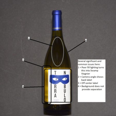
They are difficult to photograph. Read on at the bottom to see some of the common errors seen in wine product photographs.
Rim Lighting
There are endless ways to light and accent beautiful wines. Featured here are five attractive styles. Some lend themselves to certain bottle types better than others.
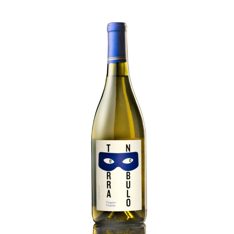
Dark Edges
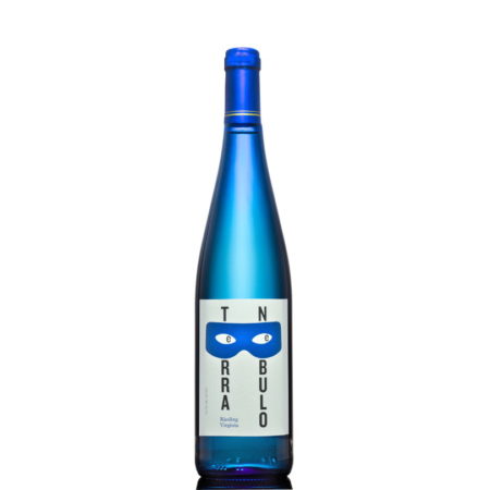
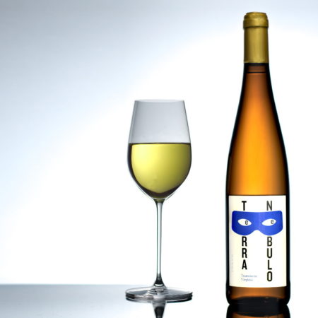
White wines typically require a dark contrast. Darkened edges and bright internal lighting go together well.
Light Stream
The light pattern makes a spotlight focus and is a favorite for Burgundy as well as Rhone to Rhine bottle shapes that have longer necks with no sharp transitions.
Curtain
This lighting provides a minimalist approach to creating contrast and adding interesting highlight.
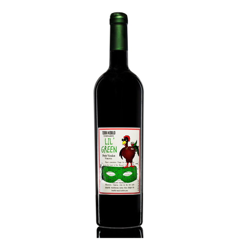
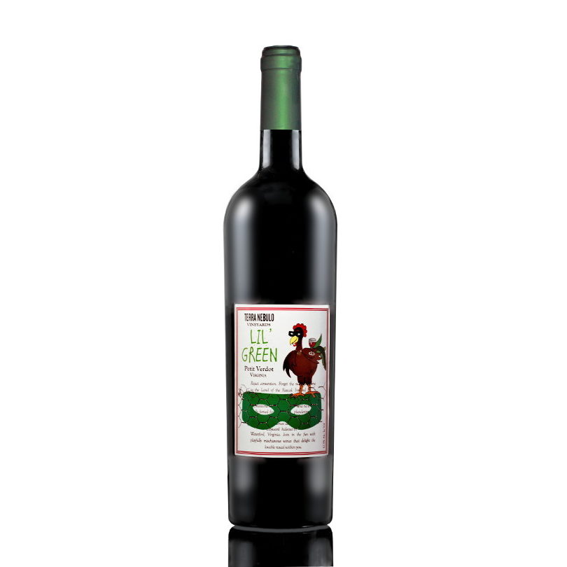
Silhouette
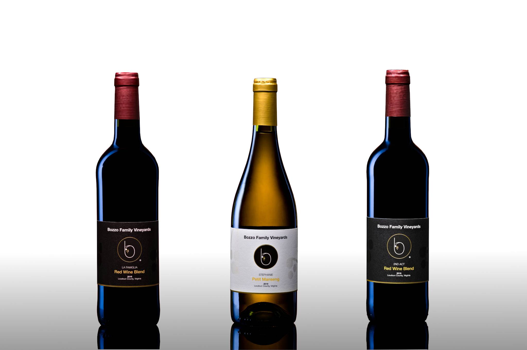
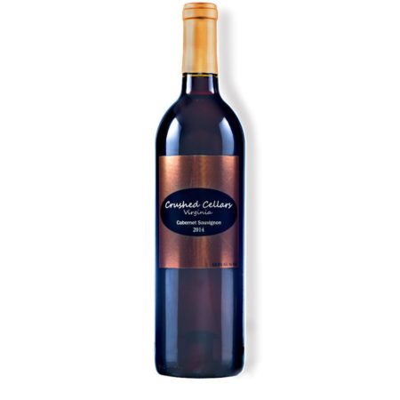
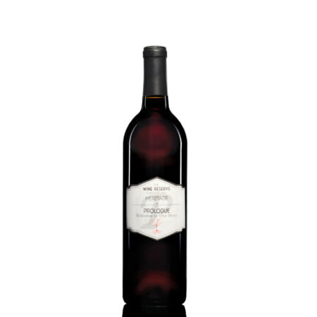
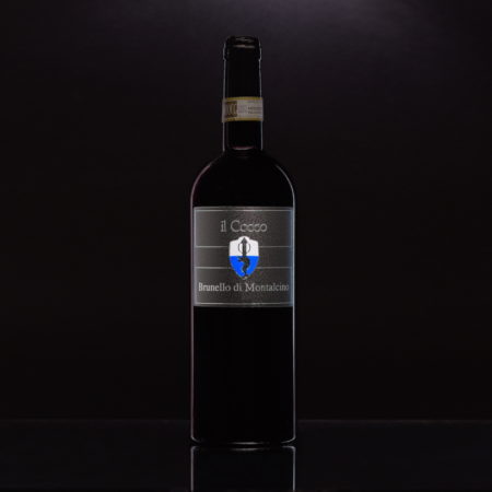
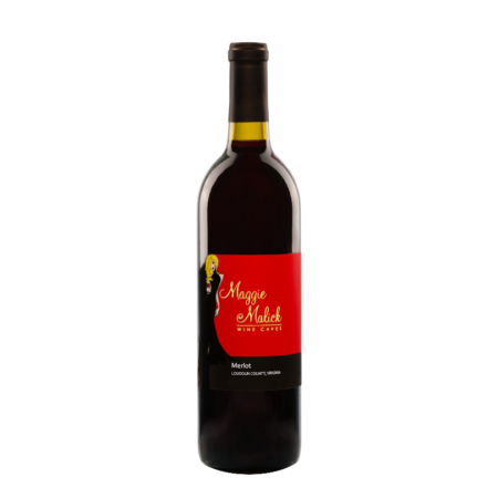
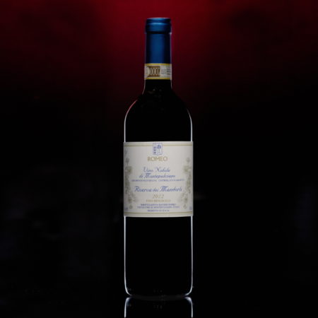
A silhouette is attractive for red wines with a dark interior showing a slight and bright rim. It is especially good for dark bottles, adding a quiet air, or even mystery. Typically, the capsule is darker. With white wines or rose, it may be combined with a glowing-styled fill.
Silk Shoulders
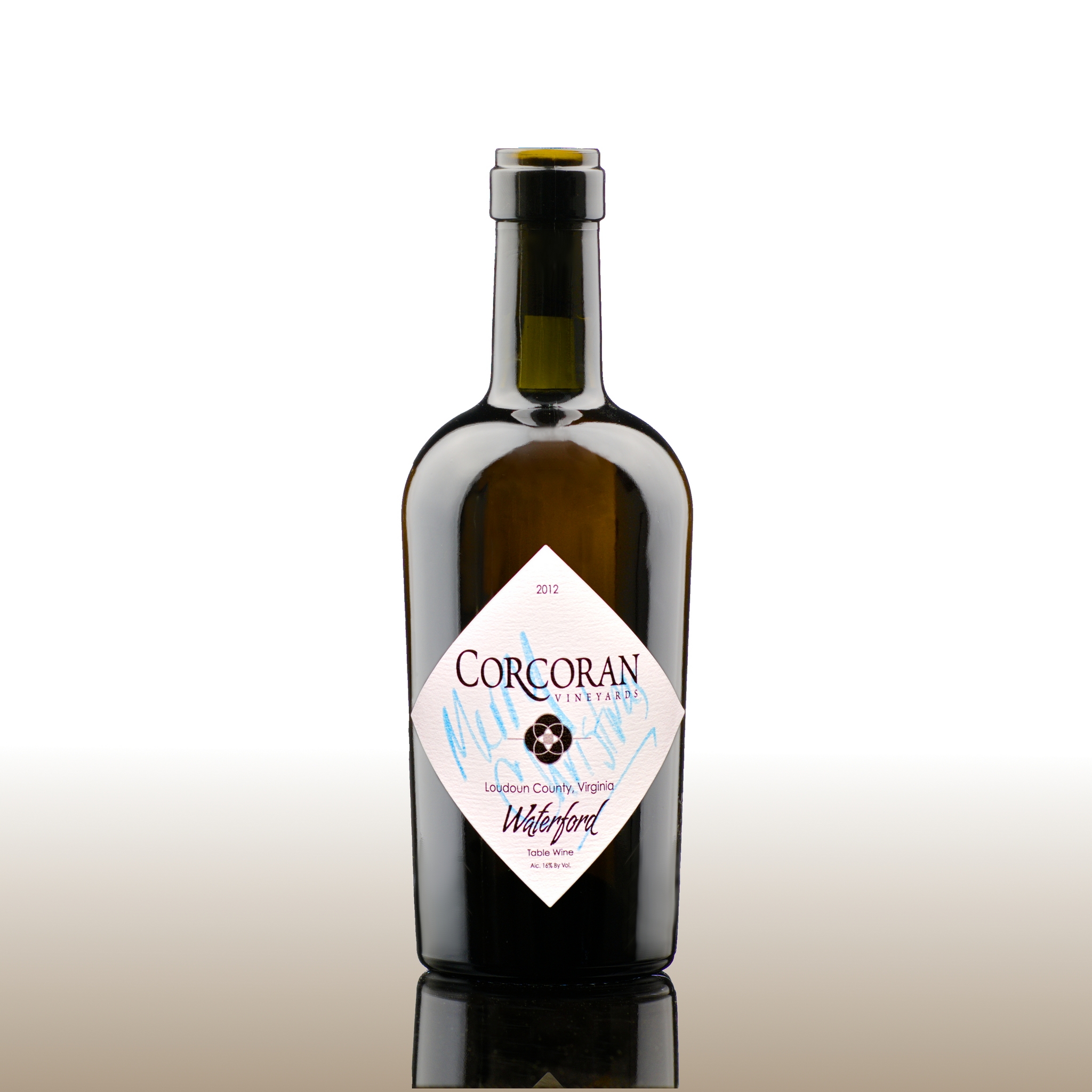
This style has accent and elegance, perhaps even romance. The thin streaks of light are clean and allow an interesting label to be framed beautifully.
Bright Columns
It is a classic technique that lends strength and character to the setting. The columns may be single or bilateral.
Frosted
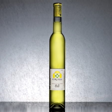
It gives a soft, pleasing edge to the lighting and can be based upon any of the above rim lighting techniques.
None
With a glowing fill, it is not necessary to add rim lighting. The dark edges provide separation and contrast.
Base
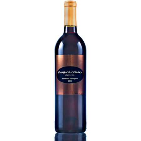
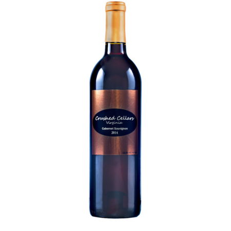
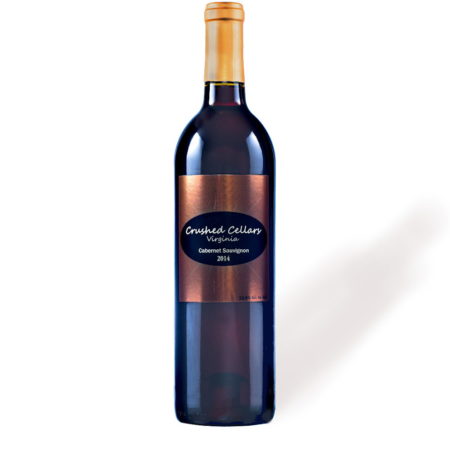
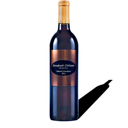
The base on the product creates an opportunity to add depth of field or stature. It is best to shoot with a reflection and edit to suit your needs. Shadows and a clean base are easy post-production options.
Reflection
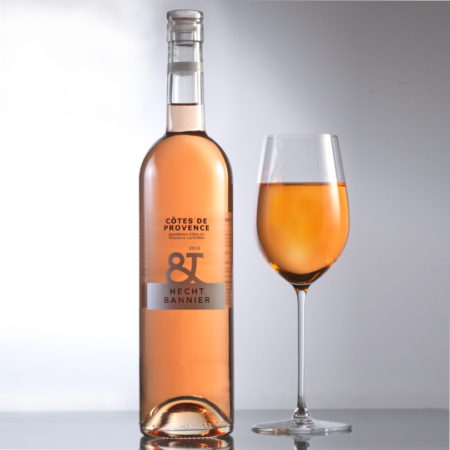
A reflection at the base mimics a reflection pond and adds a thoughtfulness, beauty and elegance.
Clean – None
Sometimes simplicity is best. Or, perhaps the product has a lot going on and nothing is needed.
Shadow
An image might seem dull or flat. But, with a shadow, it becomes three dimensional. A light shadow gives depth with simplicity. A dark contrast shadow can add independence or strength. A relief shadow is a more compact element of depth that is more friendly to narrow images.
Fill
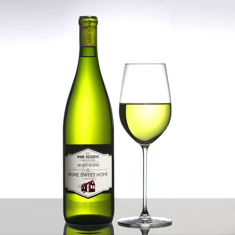
This tells the customer about what is inside. It can glow with rich color, or have a secretive shaded appearance. Gradients add character.
Glow
An excellent element to add for whites and even rose.
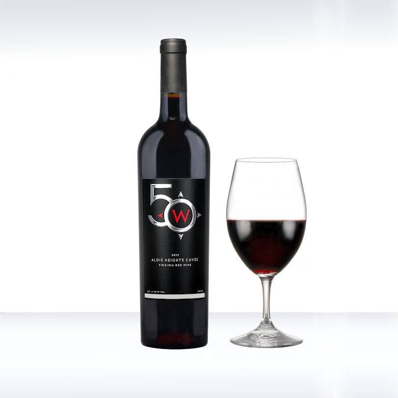
Dark Glow
Showing a small translucent core can add a touch of lightness to otherwise dark red wines. This may be a nice choice for a Norton, Pinot Noir or a medium to light blend.
Bottle Gradient
A shadow that moves into light, within the wine can elevate a plain bottle to become distinguished. An ordinary setting gains character.
Label Gradient
For old an world look, a shaded label can be appealing. With the shadow darkening left-to-right, it can add an air of solitude. A shadow that opens lighter to the right brings thoughts of a new dawn. These are particularly attractive with matte paper labels.
Tint
Some wines are dark and rich, or perhaps the bottle doesn’t allow light though at all. A slight addition of color to the rim lighting lines and highlights can make a positive difference.
Background & Accessories
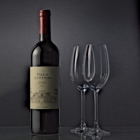
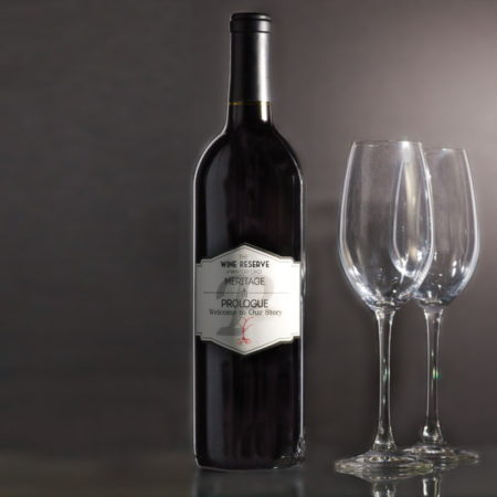
The background of an image gives context and might tell part of a story. Accessories can reveal the history of your wines, show how fun they are or even tell where they might take you.
Low Key
Quiet and thoughtful come to mind with this background style. Romance or love may be perceived with the right accessories.
High Key
Simple, bright and optimistic. Its focus is on the product and is a favorite choice in catalogs. The background does not have to be pure white and a vignette may be used to blend the into an off-white page.
Transparent
This is a simple image setting to allow your current site colors or imaging to show through. Transparency may be partial.
Grained or Textured
This look lends an air of the classics. It invokes age and history.
Color
A wildcard. Colors can convey almost any emotion or setting. May be used for special cases or occasions.
Accessories & Food Items
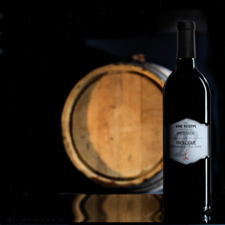
Include your menu items. A glass, a barrel or even a loaf of bread makes a shot more interesting. Show off your food offerings.
Undesirable Elements
Perhaps you’ve seen these: Radial flare, Edge flare, Skirt flare, Reflection clutter, Flat images, Dirt, Uneven exposure, Illegible labels. They are hard to avoid and detract from a product. Winedog can make these a thing of the past.
Radial flare
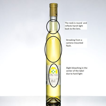
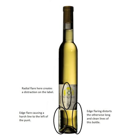
Frontal lighting causes this. Light sources must be behind the subject. This can come from a camera-mounted flash or even daylight coming in through a window behind you.
Edge flare
When there is intense light off-center and behind and bottle or glass, a bottle becomes a lens and may bend light directly into the camera.
Skirt flare
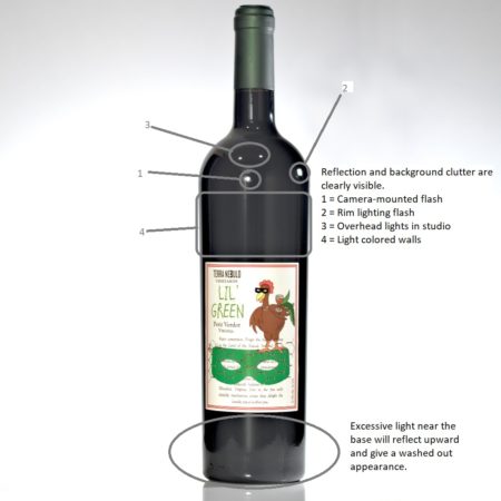
More lighting problems! If there is a highly reflective surface as a base or excessive overhead light, it may reflect into the area just below the label (around the punt) and begin to ‘blow out’ the white levels.
Reflection clutter
Unavoidable, without strict light control. Bottles and glasses are round and reflect everything. Have you ever been able to see yourself or the room in one of your photos?
Flat images
Good photographs call for more than a bottle. Use transitions of light or colors, reflective bases, interesting shadows, rims lights or shadows that lead the eye.
Dirt
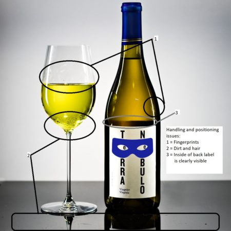
Most DSLR cameras have 24 megapixels of resolution. If it is there, they see it. Dirt, lint, fingerprints and even bugs can be discovered in photographs. Don’t use paper towels. Winedog uses microfiber only. Use strict handling protocols when moving and repositioning. Clean, clean, clean.
Back Label ShowingLack of separation
Bottles and accessories may glom into the background. A low F-Stop value may cause this, But, even more likely, the side colors and shading are the culprit. White wines need black reflective surfaces. Red wines, need black and white.
Illegible or off-center labels
The customer will remember an image, so make it clear and attractive. Make sure your brand name, the wines’ name and characteristics of the label are clearly visible. BTW, it’s a good idea to clear off the vintage year. Few folks read it on the bottle and no one will notice it’s not there. If you have no label changes, it saves you from having to re-shoot that bottle for next years’ catalog.

